In Part 1 of this piece I discussed how I use my GPS watch during workouts. In Part 2 I will discuss how I use the data gathered by the watch to analyze race performance. I will look at the difference between a specific training run and a race shortly thereafter to answer, at least in part, the question "what went wrong in this race?" I will also look at a different race and show how the data helps answer the question "How much did that minor injury affect my performance?" In doing these analyses I will explain a bit about what all this data means, and hopefully provide enough context to help others interpret their own results.
As with Part 1, this piece will be rather long and fairly technical.
What Went Wrong
In all honesty I probably don't come out of this particular story looking well. In a nutshell, I allowed myself to believe in unicorns only to have them desert me when I needed them most. With that out of the way you need not spend any time while reading this section wondering "does he know how bad this makes him look?" I do.
That said, let us go back a couple of years to a time when I first experienced "super-compensation." This is the phenomenon of your body responding to a reduction in training intensity by briefly attaining a much higher level of capability. In a perfect world this would be perfectly timed to happen on race day, although I don't know how one brings about that result (and my coach has been mysterious and elusive when questioned about this ). One morning I set out on a run. I expected this run to be about 8-10 miles as it was a 75-minute run. The goal for the run was to run evenly and to keep my heart rate in the upper portion of my heart rate zone 2. I started out running hard to get my heart rate up, figuring that I would be able to find the correct cruising effort once the heart rate was elevated. The first mile of the route I had chosen was uphill, which I knew would help with elevating the heart rate. I also knew that once I was past one traffic signal after the first 100 meters I would be able to do the whole run non-stop. As I ran uphill I felt like I was working somewhat hard, but in control. I quickly reached a landmark which I know to be about a kilometer from home. My watch beeped and told me that I had run that first km in 4:00. "What!?!" I thought. This is a pace which I expected to need to be working much harder to achieve. My heart rate was quite high, but it does sometimes spike at the beginning of a run so I wasn't too concerned about that. I maintained roughly the same effort for the second km. 3:59. Definitely something going on here. By this time my heart had settled into the desired range and I was focusing on running smoothly. It felt almost effortless to maintain this heart rate. Actually, the problem, if any, was that my heart rate kept creeping into zone 3 and I needed to back off a little bit to keep it in zone 2. The kilometers flowed by. 3:52. 3:47. 3:46! Still running comfortably. The fact of casually running a sub-20:00 5K still astounds me even two years later. I do slow a bit through the middle of the run, but managed to finish back at home having run 18.75 kilometers in 75 minutes. An average of 4:00/km, and on pace for about an 85 minute half marathon, more than 10 minutes faster than my PB. I was gobsmacked. Then I thought that I had better go find a race to run.
Two weeks later I find myself in Peterborough at the starting line of the Great Eastern Run. I thought that I was either about to have an amazing race, or a mediocre one. Of course I was hoping for the former. I had it in my head that I could run at the perceived effort level from my amazing training run and coast to a PB. I had this mental image of running the first kilometer hard and then settling into a pace similar to the training run. My actual experience was radically different. I ran a decent first kilometer, 4:05, and then dropped quite a bit of pace. Ultimately I ran a 1:40:00 half-marathon, which averaged out to 4:40/km. Respectable, but not close to a PB. Clearly I was no longer in super-compensation, but was there something else going on? A quick look at the data says that there was.
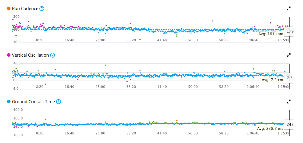
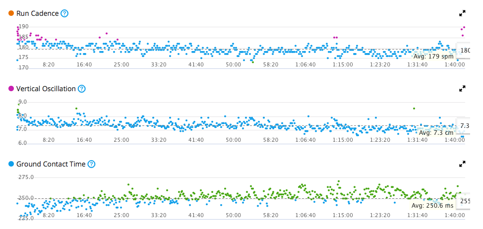
First let's look at the data from the training run. In particular the three graphs which show what are called "run dynamics." These are run cadence, vertical oscillation, and ground contact time. I presume that people are familiar with the idea of cadence, which is simply steps per minute. Note that Garmin measures this as footfalls per minute, whereas many others use steps per minute. A step is simply two footfalls, one left and one right, so if you want the steps per minute number simply divide by 2. Vertical oscillation is a measure of how much your body is rising and falling with each stride. Lower values are better here, as a higher number indicates expending energy to lift you body rather than drive it forward. The ground contact time is also an efficiency measure. The longer your foot stays on the ground, the greater the breaking effect. The Garmin colour scheme for these graphs is, from worst to best, red, orange, green, blue, purple.
Here are the graphs from my training run. In the cadence you can see that I was working my legs a bit harder early in the run, and then settled into a fairly consistent stride. The vertical oscillation and ground contact time tell a similar story. In all three graphs there is a fairly strong sense of a consistent level of performance, with occasional glitches. I felt like I was running smoothly and easily and the data seems perfectly consistent with that impression
For the race day the data tells a very different story. The colour scheme is fairly similar except for the ground contact time. What is noticeably absent, however, is the level of consistency. Starting with the cadence, it is clear that I was struggling to keep my feet moving in any sort of rhythm. After the opening push my feet kept slowing down, perhaps not enough to have been noticeable to an outside observer, but obvious in the graph. As the race went on the problem got worse, but even in the first 20 minutes you can see a pattern of slowing followed by a burst of over-compensation, a brief period of improvement, although still mediocre, and then another slowing. The vertical oscillation tells another part of the story. In general, as my cadence slowed my vertical oscillation worsened. This makes sense. I was coming further off the ground, thus slightly lengthening the time between steps resulting in a lower cadence. Another way to read this data, though, is that the times of slower cadence were actually when I was trying to push myself to increase my speed, but was actually making things worse by pushing myself higher off the ground. This interpretation makes a lot of sense, and fits in neatly with the idea that running is harder when you are trying to consciously run rather than allowing your body to do what it knows how to do. My mental process through a lot of this race was to try to relax into the running, believing that the magic from the training run would reappear and whisk me along (this is the belief in unicorns part). When that speed didn't happen I panicked a bit and tried to manufacture the speed through effort. The data is telling me that the harder I was working, the worse my mechanics became. If I correlate these graphs against my pacing I can see that the times when my cadence was low and my vertical oscillation was high my pace did increase. Since that pace increase was coming at the cost of much higher effort it simply wasn't sustainable. The data from the ground contact time doesn't correlate well with the other graphs, but is indicative of my generally failing to keep my feet nimble, having a complete lack of consistency, and worsening through the race. Even without all of that analysis, a cursory comparison of the two sets of graphs shows neat lines from the training run, and a noisy mess from the race.
While it isn't a pretty picture, the data shows very clearly what went wrong in the race. It also shows why my attempts to correct matters during the race felt so tiring. I had gone into race day with a hope that I would easily find the ease and pace I had experienced in training, and when that failed to materialise I had no plan B.
Injury Effect
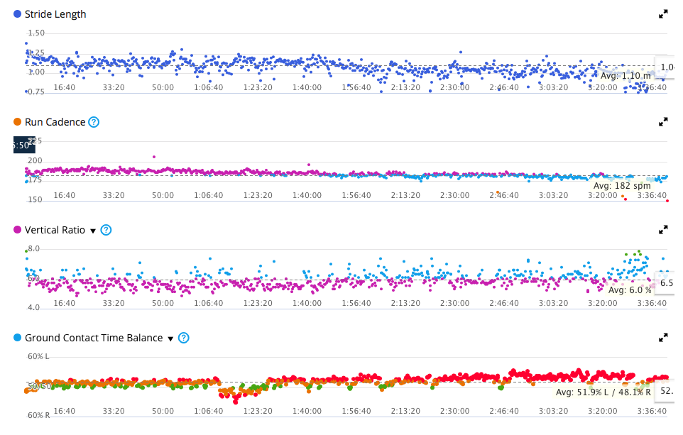
The 2016 Berlin Marathon was a highly succcesful race for me in a number of ways. I felt comfortable for a lot of the race, my mental approach opened up new possibilities, and I finished feeling quite happy. The one thing that didn't happen, though, was the PB time I had been hoping for. Almost as soon as I crossed the finish line I became aware of a soreness in my inner thigh/groin which had surfaced in my final track sessions. I suspected that this injury, although I hadn't been aware of it during the race, might have been the culprit. Fortunately Garmin had expanded the scope of their run dynamics, perhaps as a result of my switching to their newer heart rate monitor and sensor strap when I changed watches. In any case I now had access to a new graph showing Stride Length, the traditional Run Cadence, and enhanced versions of Vertical Oscillation and Ground Contact Time which now appear as Vertical Ratio and Ground Contact Time Balance.
The first thing that stands out for me in these graphs is that my stride length is very inconsistent, and my Ground Contact Time Balance is not very good. I suspect that these two things are related. One of my most stubborn physical challenges as a runner is my hips. They are quite tight, and distinctly asymmetric. My left hip works closer to the way I believe hips are meant to operate, and I believe that I tend to generate more power while running with my left leg than with my right.
The Run Cadence and Vertical Ratio are both fairly good here. There is a clear reduction in cadence and worsening of vertical ratio over time, but that seems unsurprising over marathon distance. The change in the dynamics after 3:20:00 is due to my walking a chunk of that last stretch.
The bigger part of the story is told by the Ground Contact Time Balance. For the first hour this balance looks like it may be as good as I can manage. There is clearly work to be done here, but this is at least consistent and tightly grouped. Then something happened. I don't know what. I wasn't aware of this happening at the time, but all of a sudden I started favoring my left (injured) leg. From this point onward I was apparently struggling to regain my equilibrium. There was a clear price paid in pace from this point forward. I believe that this graph shows that the injury was bothering me far more than I was aware. Either I was trying to compensate by working that leg harder, or perhaps I was spending more time on that leg as I wasn't able to move off of it as quickly as I had when it wasn't acting up. In either case this change was subtle enough to likely not have been visible to an observer, yet strong enough to have cost me some speed. Tantalizingly, this graph also seems to indicate that there is still a fair amount of improvement I can potentially make in my stride,
Conclusions
In addition to being a useful tool to validate, or contradict, your impressions of what happend on a run, this data can be very useful in understanding where to focus your attention in your attempts to become a better runner. It is reassuring to see that a very good run was in fact one where mechanics and stride efficiency were good. It is also reassuring to see that a poor run is often connected to something going wrong with mechanics. While there is some thinking that goes into analyzing this data, it is hopefully the case that the data itself connects with what your body has already been telling you and is thus useful even if you aren't a data geek.

Leave a comment